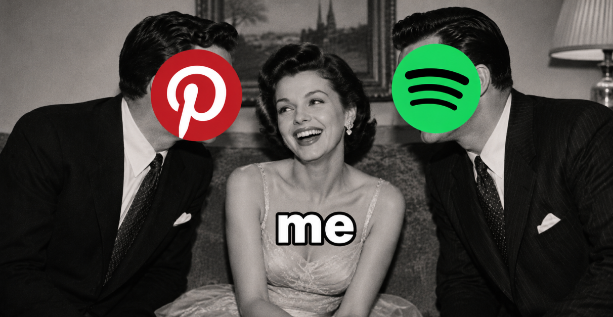
If you spend any time tracking viral formats, you know that the traditional product demo is completely dead.
Nobody wants to sit through a three-minute tutorial explaining feature sets and user interfaces. And that’s why we love writing about how apps are getting better at hiding product demos inside formats people want to watch.
One angle we’ve been seeing all over our feeds lately is wrapping the entire reveal inside the idea that “this was made for Gen Z.”
You’ve probably see these hooks; “I love Gen Z because wdym…” or “WYDM there is a Spotify but for Gen Z??” and it was no coincidence.
It might look like internet slang on the surface. Underneath, it does three jobs at once. It names the category, makes the product feel culturally current, and turns the reveal into something the viewer wants to understand.
When it works, your viewer feels like you’re watching someone react to a new thing the internet just discovered.
Here’s how apps are using it.
The Replacement Frame
This is basically [familiar app] but better/made for Gen Z.
Start with the old default in your category. Then reframe your app as the younger and best new alternative of it .
This one positions the new product as the natural evolution of something everyone already knows then adds the cultural FOMO layer on top.
“I love being a teenage girl in 2026 bc wdym Pinterest and Spotify just made an app together”
That video alone did 18.7M views.
But they drove more than 127M total views with this kind of positioning.
Albo recreated that exact hook and updated it to their own niche:
“I love being a teenage girl in 2026 bc wdym Pinterest and Notion just made an app together” 1.4M views
Fable did the exact same thing from the reading community: “you look happier.” “thanks, I finally deleted Goodreads for the Gen Z version.”
It did 5.2M views.
Goodreads becomes the outdated version, while Fable becomes the exciting Gen Z upgrade.
In both cases, the app is instantly introduced as a modern or superior replacement for an older product that people already understand.
The Absurdity Frame
This one leans on pure shock value: you take something mundane (studying, resumes, reading) and describe the app as though someone crossed it with a video game or internet meme.
Deliver the hook first with a strong reaction and then move to the demo. This is ideal for apps built around a single, highly visual core mechanic.
Here StudyFetch won a couple of times using that tactic:
“I love Gen-Z because WDYM someone made a site where you turn your notes into a MARIO KART LIKE game 😭” sitting at 4.5M views.
“I HATE Gen-Z because WDYM someone made a site where you turn notes into a SUBWAY SURFERS game 😭”. That did 3M views.
Both hooks explain the app before the viewer has to think.
You instantly understand: finish a task, unlock scrolling.
ReBrain used the same mechanic from a productivity angle:
“LMAO gen z made an app that abuses you to do tasks to unlock scroll. we are cooked”- 1.9M views.
The Cultural Shift Frame
Lead with a Gen Z behavior trend, then let the app appear as the product version of that shift.
Reading is coming back. Young people are studying differently. People are deleting old platforms. Faith content is getting more public. Productivity is being gamified.
The app should sit in the movement and look like the natural tool inside it.
Creed Bible app has used this well by framing the product around a visible shift in youth culture: Gen Z talking more openly about faith, prayer, and spiritual discipline.
@fablereadsbyjassy for reading app Fable: “life feels a little brighter knowing Gen Z finally has a reading app” — 5.2M views
It’s all about selling a feeling: reading now has a more social, more current, more online home.
–
The bigger point is that “Gen Z” is not just a demographic label in these videos.
It is a shortcut for making a product feel like the new version of a category people already know.
The app does not need to be complicated.
It just needs to feel like the internet found the newer, cooler version first.
Leave a Reply