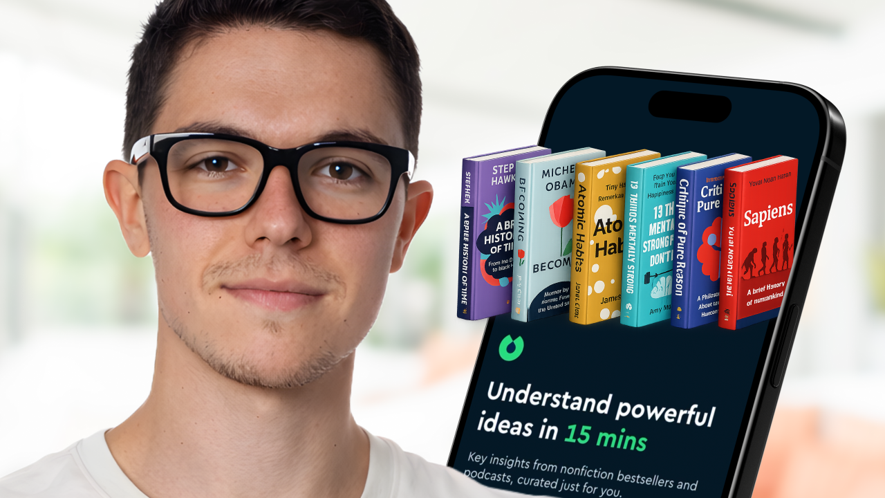
Let’s break down Blinkist:
Static first screen with clear, value-first copy.
Onboarding ties usage to real moments (“while you run”), anchoring the product to daily routines.
Content and reading screens stay flat and minimal, with standard layouts and simple transitions.
Search is the standout: topic-driven, high-density, and the empty state doubles as a strong discovery surface.
Leave a Reply